Five Pillars of Data Analytics That Actually Matter
This blog breaks down the five core pillars of data analytics—MS Excel, SQL, Data Visualization, Statistics, and Domain Knowledge—in a simple, practical way. With real-world examples and relatable language, it’s perfect for beginners, professionals, or anyone curious about how data can solve real problems and drive smarter decisions.
Rakesh Arya
5/6/20254 min read
Let’s get this straight—data analytics isn’t about buzzwords or fancy dashboards. It’s about solving real problems using data. Whether you’re running a business, working in marketing, managing operations, or simply curious about how things work, these five pillars will give you a solid foundation:
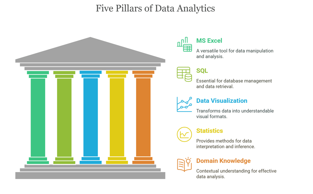
1. MS Excel
2. SQL
3. Data Visualization
4. Statistics
5. Domain Knowledge
This blog isn’t theory-heavy. It’s a practical guide built from real-world experience. Let’s get started.
1. MS Excel: The Surprisingly Powerful Old Friend
Everyone’s heard of Excel. Most people have used it at some point. But very few realize how powerful it actually is.
Let’s say you run a home bakery. You jot down orders, prices, delivery dates—all in Excel. One day, you want to know which product made the most money in the last three months. With a few clicks—maybe a pivot table, a quick filter, and a SUM—you have your answer.
No code. No waiting. Just data to decisions in under five minutes.
People love to mock Excel as outdated, but here’s the truth: It’s still the most widely used analytics tool in the world. Every finance team uses it. Every operations team swears by it. Even data scientists use it for sanity checks.
The key? Learn the stuff beyond the basics—pivot tables, conditional formatting, SUMIFS, VLOOKUP, INDEX-MATCH, and charts. These are your secret weapons.
2. SQL: The Language of Data
Imagine you're trying to find something in a huge room full of files. Instead of searching manually, you shout, “Bring me all customer records from last week where the total spend is above ₹10,000.” Boom, the exact files are in front of you. That’s what SQL does—but with databases.
SQL (Structured Query Language) is how we interact with databases. And since most organizations store their data in relational databases, SQL is everywhere.
Here’s a simple, real example:
Let’s say you work in a gym chain. You want to know which members haven’t visited in the last 60 days so you can send them a reminder. With SQL, you write a query that pulls that list out in seconds. Done. Actionable.
SQL isn’t hard once you start using it. Start small:
SELECT: to pick columns
WHERE: to filter rows
GROUP BY: to summarize
JOIN: to combine tables
Even basic SQL will make you 10x more efficient.
3. Data Visualization: Don’t Just Show Numbers, Tell a Story
Nobody likes staring at a sheet with 500 rows of numbers.
But show that same data as a bar chart that says, “Here’s where our revenue dropped after the last campaign,” and people instantly get it. That’s the power of data visualization.
Now, don’t overthink the tool. You can start with Excel. Move to Power BI, Tableau, or even Google Data Studio when needed. The key is not the tool—it’s what you choose to show.
Example:
You’re working in HR. You need to convince your manager that employee satisfaction is falling. You build a dashboard showing survey scores dropping quarter by quarter. No argument. The data speaks.
Good visuals help people see the insight—without needing to explain it in 200 words.
4. Statistics: Making Sense of the Mess
The moment people hear the word “statistics,” they either tune out or picture complicated math. But honestly, statistics is just a way to make sense of data.
Let’s break it down.
Say you manage a food delivery app. You’re seeing a spike in customer complaints. Now, you could randomly guess what's going wrong—or you could analyze the complaint data.
Here’s where statistics helps:
You calculate averages to find the usual delivery time.
You check variability to see how often deliveries are late.
You run a trend line to see if things are improving or getting worse over time.
Even basic concepts like mean, median, mode, standard deviation, correlation—they go a long way. You don’t need to run t-tests and chi-squares every day. But you do need to understand what the data is really telling you.
Why? Because raw data lies. Patterns hide in noise. And statistics helps you separate what matters from what doesn’t.
5. Domain Knowledge: The Secret Sauce
This is the pillar most people overlook.
You can be great at Excel, fluent in SQL, and build the prettiest dashboards—but if you don’t understand the business, your analysis is useless.
Let’s say you’re analyzing churn in an OTT platform (like Netflix). You see a group of users cancelling after just one month. Is that a problem?
Well… depends.
If you understand the industry, you’d know some users only subscribe for a specific show or during the holidays. That’s expected behavior. So trying to “fix” that churn is a waste of time.
Or imagine you’re working with sales data in a B2B SaaS company. If you don’t understand what “lead qualification” or “trial conversion” means in their business model, you’ll misread the entire funnel.
Domain knowledge turns surface-level reports into real insights.
And it’s not something you memorize—it’s something you learn over time. Talk to people. Ask questions. Be curious.
One Last Story: All Five Pillars Working Together
You’re hired by a mid-sized retail chain. Sales are flat. Leadership wants answers.
Step 1 – Excel:
You open Excel to explore the data quickly. A few stores are clearly underperforming. Pivot tables help you spot which locations are lagging.
Step 2 – SQL:
You query the central database to pull detailed transaction data. You discover that repeat customers in the poorly performing stores have dropped significantly.
Step 3 – Data Visualization:
You build a simple dashboard in Power BI. It shows exactly when and where the decline started. The leadership team immediately sees the pattern.
Step 4 – Statistics:
You run a quick comparison using averages and percentage change. It turns out the average discount given to returning customers dropped in the last quarter.
Step 5 – Domain Understanding:
Since you understand retail, you connect the dots. The loyalty program was silently downgraded to reduce costs. That caused loyal customers to stop coming back.
The solution? Reinstate the original loyalty benefits. Within a few weeks, repeat customer traffic improves and sales start climbing again.
Mastering data analytics isn’t about being perfect in one tool. It’s about combining these five pillars and knowing when to use what.
Excel gives you speed.
SQL gives you control.
Visualization gives you clarity.
Statistics gives you depth.
Domain knowledge gives you direction.
Learn them one by one. Apply them in real life. And remember—data doesn’t change the world. People who understand data do.